Product pages are one of if not the most important step in a customer’s journey through your sales funnel – there’s no doubt about that. Unfortunately, ecommerce isn’t an exact science, and product pages aren’t created equal.
From back-end to front-end, there’s a lot you need to consider when designing and optimizing your product pages. Today we’ll focus on the latter, exploring the aspects of your pages customers actually see – media, product descriptions, statistics, CTAs, etc.
And we’ll do it all with the help of product page examples from some of the greatest ecommerce companies in the world today. So, take a seat, grab a drink, and get ready to be inspired.
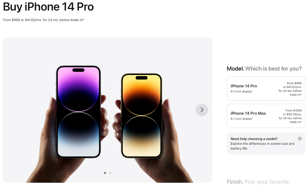
#1 Apple | Match Product and Page
Apple follows the same design philosophy for both its products and product pages – simplicity and minimalism above all. Its product photography is clean and without distractions. Copy is short and simple, differentiated with slight changes in color, or enclosed in borders mirroring the outline of its smart devices.
However, that’s only the Above the Fold (ATF). If you scroll down the page, you’ll find the product description, more of Apple’s sleek photography, and a section recommending alternative products. Interestingly, Apple prioritizes a purchase CTA above a product description – likely because they expect people to be already familiar with their products.
All in all, Apple is a company that is very in tune with its customers’ expectations and desires. The entire product page evokes the impression that you’re looking for high quality and worth the price tag.
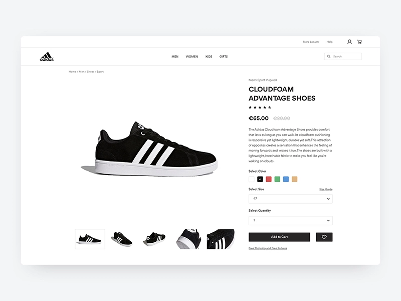
#2 Adidas | Create a Sense of Community
With a more diverse catalog of products, Adidas (or its competitor Nike) can’t create a cohesive, all-encompassing design for all aspects of its identity. Instead, the company makes the smart move and opts for a complete lack of identity on its product pages.
The product takes center stage with detailed photography, offset by a detailed product description. It makes purchase simple with an easy-to-use color and size-picker. But the genius of this product page shines through below the fold of the product page.
Underneath the ATF, you’ll find several roll-down sections with ratings and reviews, the product’s inspirational story, and a showcase of user-generated content from various social media sites. Underneath that still, there’s a section highlighting products that should fit the style of whatever it is you’re looking at to increase the potential purchase size.
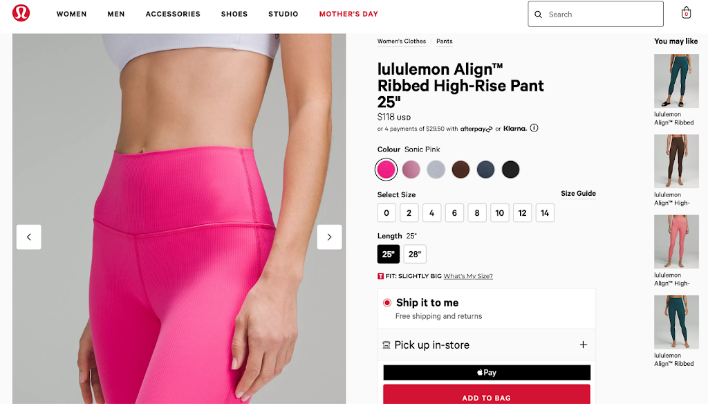
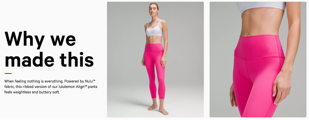
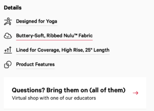
#3 Lululemon | Invite Conversation
Lululemon is almost just another apparel ecommerce store. But the emphasis in that sentence is on almost. What sets Lululemon’s product pages apart from other shops is its use of an Apple Pay button directly on the ATF part of the page.
Removing the barrier of a shopping cart and empowering impulse buying is an ingenious way of boosting conversions in a single, simple step. The product recommendations in the right-hand sidebar are also a nice touch.
Another thing that needs to be complimented is Lululemon’s use of a chatbot for answering FAQs. By using the “Questions? Bring them on (all of them)” CTA, they humanize their brand and build a good rapport with the customer.
Lastly, the company uses an inspirational section below the fold to confirm the buyers’ intent and speak to their personal values, further confounding the effect their page has on customers’ perceptions.
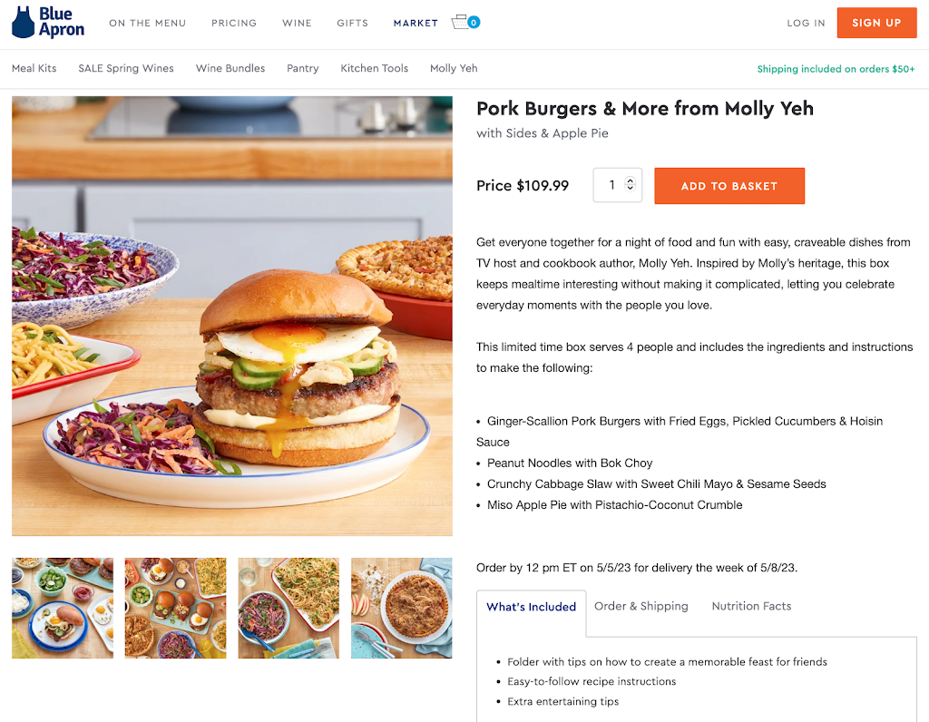
#4 Blue Apron | Paint a Picture
Blue Apron is a subscription-based meal-prep delivery service, which would make you think they have no product page to speak of. At first, we considered highlighting its use of a quiz instead of a product page, which is a great technique for any product that allows it. But in the end, we opted for their more traditional ecommerce product pages for their package deals.
The strength of Blue Apron’s product page in this sense comes from the mouth-watering food photography but also the beautifully evocable copy on the side. By detailing not only the high-quality ingredients you’ll receive, but also the high-quality you’ll get out of them with your friends and family, Blue Apron speaks to our expectations of a good time beautifully.
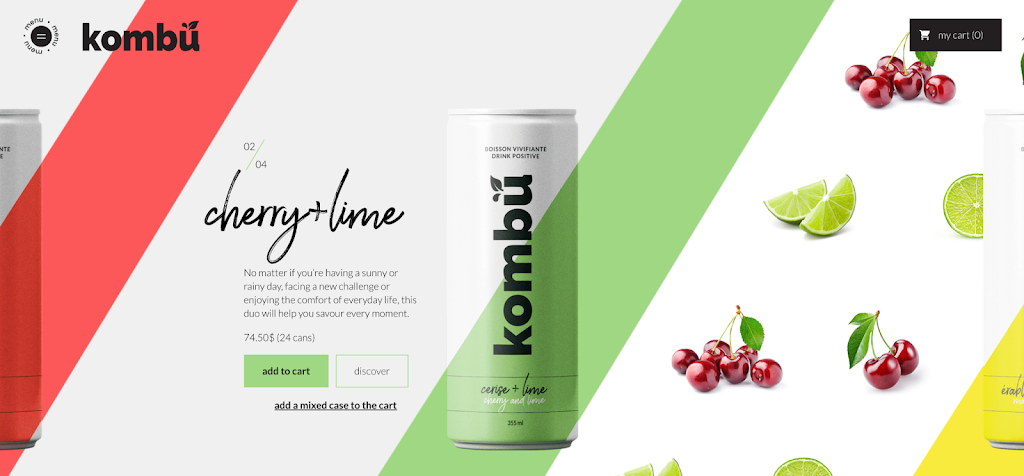
#5 Kombu | Don’t Overcomplicate Things
Sometimes simpler is just better. Kombu, the drinks manufacturer, perfectly grasps this concept in their all-in-one product landing page. Instead of searching through various tabs, the company gives you exactly what you’re looking for as soon as you visit their page.
You see, Kombu’s home page is their product(s) page. In the center of the vibrant design is just a picture of their can, a short description, and a simple CTA. Instead of scrolling down, the page scrolls between flavors.
This is an excellent example of how you can do a lot with very little. The copy and images do all they have to and nothing more, eliminating any confusion or long reading before the “Add to Cart” button is pressed.
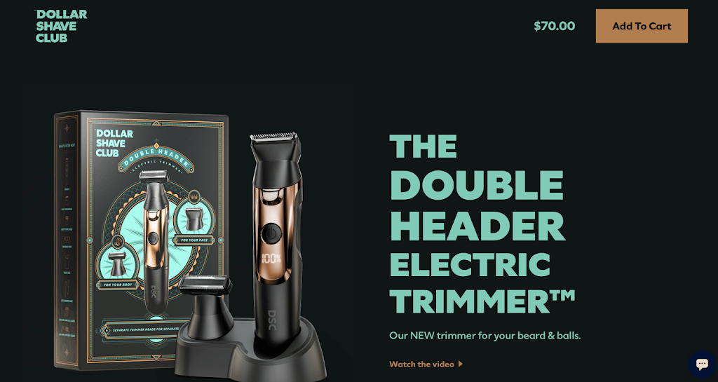
#6 Dollar Shave Club | Mold Customer Expectations with Media
Dollar Shave Club is also a proponent of simplicity. Once you visit the company’s product page, you’re met with a striking product image and a bold headline. DSC can afford this because, on top of their purchase CTA, they’ve included the option of watching a product video.
By smartly leveraging their on-site media, Dollar Shave Club “shaves” off precious minutes you’d spend reading their product specifications. Furthermore, letting the video do all their heavy lifting allows the company to tailor your expectations by presenting the product in whatever way they see fit.
And at that point, an “Add to Cart” button at the top right is all you really need.
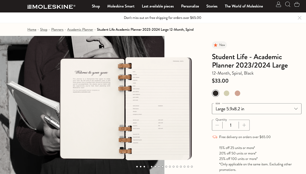
#7 Moleskine | Provide a “Hands-On” Experience
At first glance, Moleskine’s product page may seem like any other. But the crucial difference here is not the page’s layout or copy. Although, with that being said, highlighting free delivery and bulk savings are always a nice touch.
No, what sets Moleskine apart from other ecommerce product pages is how they let the potential buyer engage with their product. The buttons featured beneath the lifestyle + product preview visuals actually flip through the pages, allowing users to be completely sure that this notebook is right for them.
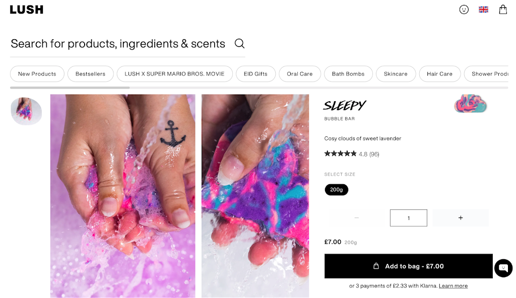
#8 Lush | Educate Your Customers
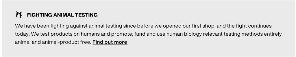
Again, Lush may seem like your standard ecommerce site. But that’s only until you look beneath the fold. Lush reinforces its position as a provider of positive things both in the bathroom and the world by highlighting how it approaches the impact of hygiene products on the environment.
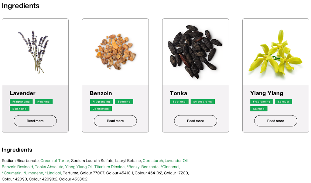
At the same time, it reassures viewers regarding the safety of its products by including a section dedicated to educational resources for each ingredient that goes into making them. In that way, Lush casts a wide net, targeting both environmentally and health-conscious individuals. And since it’s one of the few companies that does this so thoroughly, the customers this appeals to keep coming back.
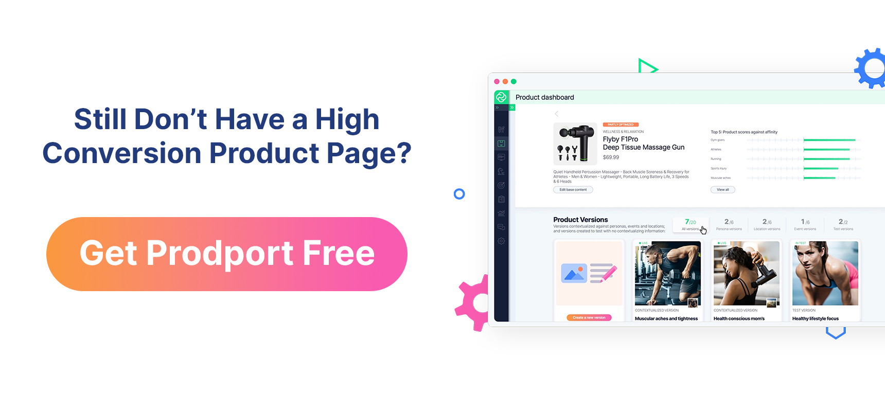
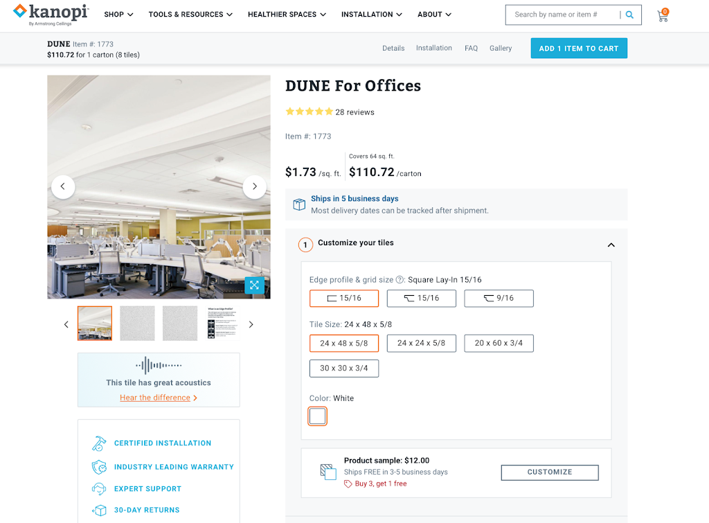
#9 Kanopi | Automatically Adapt to Your Customers
You might be surprised to learn this, but the page below isn’t the same one you’d see if you were to visit Kanopi’s product page. And that’s the case for every Kanopi landing page we include here.
That’s because this ecommerce store tweaks the look and content of its product pages to match your unique buyer persona. How do we know? Well, because we helped them do it! Prodport can implement photos, videos, headlines, product descriptions, and reviews that reflect the viewer’s search intent without any programming by pinpointing a user’s position in their buyer’s journey.
If that sounds like something you’d be interested in, we encourage you to check out our article about Personalizing eCommerce Product Pages to March Seasons, Personas, and More.
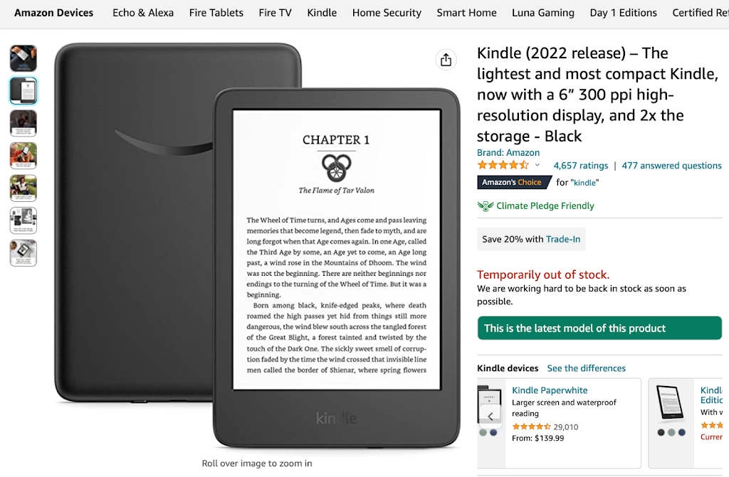
#10 Amazon (Honorable Mention) | Understand Customers’ Buying Patterns
Unlike the other product pages showcased so far, Amazon takes a maximalist approach to its design. Its featured images contain few stand-alone product pictures, highlighting various lifestyle situations to help you visualize using the product instead.
Amazon’s headlines are very long and descriptive, valuing SEO above all else. The description side of the page is cluttered with reviews, neverending product variations, and an exhaustive list of product specifics. All you’ll find below are related product recommendations based on others’ buying tendencies.
Nevertheless, it still works. And that’s because buyers have no loyalty toward Amazon. All they’re looking for is a good deal for a product they might not even be familiar with. In that way, Amazon perfectly matches its users’ browsing habits, helping it keep its place as the biggest ecommerce site in the world.
In Closing: What Makes Great Product Pages Great?
In our last article, 10 Guaranteed Ways to Boost Your eCommerce Product Page Conversion Rates, we gave you exactly what the title says. We covered everything from optimizing your page speed, and split-testing different product page versions for the results, to getting more people to see them with targeted and re-targeted ads.
However, five of the strategies described in that article relate to today’s topic of product page design and hence, are very worth repeating. Don’t worry; we value your time, so we’ll keep the theory short for now and touch on this again when it comes up in our product page examples.
To create a compelling product page, you should:
- Use Engaging Media: Crisp photos, illustrations, and videos are key to making customers think of your products in a desirable way. However, more importantly, you need to consider the media’s content to ensure it reinforces positive aspects of your products and works with the product page copy. This will boost customer engagement and conversion rates.
- Create Detailed Product Descriptions: A good description uses clear and engaging language to communicate benefits, remove perceived barriers, and address the buyer’s unique persona with tailored copy. In doing so, they help prevent product returns, boost conversion, reinforce company identity, and more.
- Make Your CTAs Irresistible: The difference between a successful purchase and a failed conversion is often just a solid CTA. To get the most out of your “Buy Now” button, make sure to use simple but actionable phrasing, a different, contrasting color, and logical positioning within the product page.
- Leverage Social Proof: Humans are social creatures, so even a “nod” of approval from an internet stranger in the form of a review, testimonial, or badge can do wonders. For the best results, feature social proof prominently on your product page. Just ensure it fits in with the rest of the design so it doesn’t distract.
- Personalize to Match Search Intent: Due to falling attention spans, customers expect to be served exactly what they want on a silver platter. To satisfy this need, create dynamic product pages with media and copy that automatically matches viewers’ search intent.